Gaining insights into the PGA with Python and APIs
Charting the Course
Here’s a hot take: watching golf can be boring. I basically grew up on the golf course, but for as much as I love playing the sport, sometimes it’s hard to enjoy watching it on TV. One of the reasons I love playing golf is because of how strategic and data-driven it is. During my own tournaments, I’d always carry a notebook to track my yardage, strokes, and putts. Then, I realized—maybe the key to enjoying professional golf more is getting into the data.
In this post, I’ll dive into PGA (Professional Golf Association) data, showing you how to use an API, clean and wrangle data, and perform your own exploratory data analysis (EDA). By the end, you’ll have the tools to work with APIs and you might even become a PGA fan!
What is the PGA?
PGA (Professional Golf Association) is the top professional golf league. Throughout the year, players qualify to compete in tournaments across the globe. While there is a tournament almost every week, four tournaments stand out as the most prestigious. These are known as the Majors, played on some of the toughest—and some would say most sacred—courses in the world. To better understand professional golf, I decided to analyze the Majors (plus the 2024 Olympics). I’ll be looking at last year’s Major tournaments and comparing the differences between tournaments and players to find trends that might help me get more excited to watch golf.
In the following sections, I’ll provide a step-by-step guide on how I did this by creating a dataframe using an API and how I looked into the PGA with an exploratory data analysis (EDA).
Step 1: Find your API
APIs (Application Programming Interfaces) allow different programs to communicate with each other. There’s an API for almost everything—from stock exchanges, video automations, to golf! While some require a subscription, many offer free plans that are perfect for personal projects. For this blog post, I chose the Live Golf Data API by SlashGolf.
Ethics Note
Each API is unique, so before using one, ensure that your intended uses align with its terms.For example, some APIs prohibit publishing certain information or have limits to how often you can extract data. You can often find if an API has any special terms by checking the documentation or looking at the pricing plans. By following an API’s guidelines, you can ensure that your data collection remains ethical.
After finding an API, sign up to receive an API key. This key authenticates you to access the data using Python. Like a password, it’s important to keep it secure—store it in a separate text file, and make sure it’s in your .gitignore file so it’s not accidentally shared.
Step 2: Connect your API
You can follow along with my code here
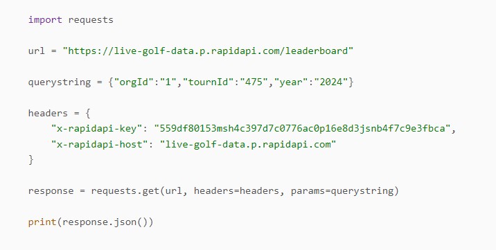
Once you’ve chosen an API, open a Python file and import the requests library, which lets you connect to your API and retrieve data. Next, read in your API key and the API URL. This is where it can get a bit tricky, as each API has different endpoints and parameters that allow you to specify the data you want.
For example, the Live Golf Data API has endpoints for players, earnings, scoreboards, tournaments, and more. I selected the leaderboard endpoint, which required parameters for the year and tournament I wanted to analyze. Many APIs offer a demo where you can test different endpoints and parameters to see what outputs you’ll receive. After selecting the parameters, you can often copy code directly from the demo to start your project. This setup will allow you to pull data directly from your chosen API into your Python environment. Here’s an example request from the Live Golf Data Documentation:
 Here’s a breakdown of the key components in this code:
- url is the link to the specific API endpoint you want to use.
- querystring is where you specify the parameters and their values (such as the tournament and year).
- headers is where you include your API key, which grants you access.
- response is the request that retrieves the data specified by your parameters.
- response.json() converts the data into JSON format, making it easy to work with in Python.
Step 3: Create your Dataframe
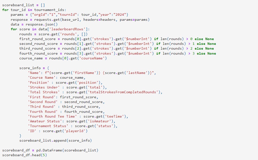
Now that you’ve successfully connected your API, the next step is to organize the output into an easy to use dataframe. The response you receive will contain multiple keys, such as year, playerId, and position, which hold various details about the data.
To extract this information, a straightforward approach is to use a for loop. This loop will collect each key’s data and append it to a list, which can then be converted into a dataframe. To access specific data within each key, use the get command, which allows you to retrieve each key’s value. Here is my golf for loop:
Step 4: Clean your Dataframe
Once your dataframe is created, it’s time to clean it up so it’s ready for analysis. In my dataset, I noticed that many scores weren’t recognized as numeric values, so I converted the columns to integers. I also filtered out any players who were cut or didn’t finish all four rounds of the tournament so there were no missing values.
Some other common cleaning steps might include identifying and addressing outliers, or removing duplicate entries. You may also want to change formatting or create new factors based on your current columns.
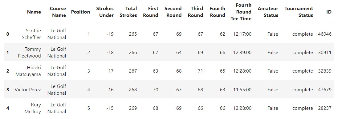
Here’s what my cleaned dataframe looks like:
 You can download the clean csv file here , or the raw csv file here
Step 5: EDA
Now that your data is clean and ready to use you can do a simple EDA to start your analysis. An EDA allows you to get a sense of trends in your data and give you an idea of what you want to explore first. Since I was just hoping to understand the data better to get more into golf I started by looking to see if there were any trends between tournaments, days of tournament, and players. Here are 3 graphs I created and the takeaways I got from them.
Strokes across Tournaments
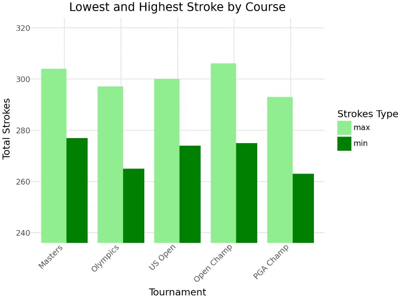 This graph displays the highest and lowest total strokes for each tournament. The Olympics and PGA Championship have the lowest scores, suggesting these courses may be easier than others. Something else to note is that there were no players of amatuer status in these two tournaments meaning that there could have just been better players at these tournaments. This would be something to explore later if it’s the course that is easy or the players that are better.
Daily Averages across Tournaments
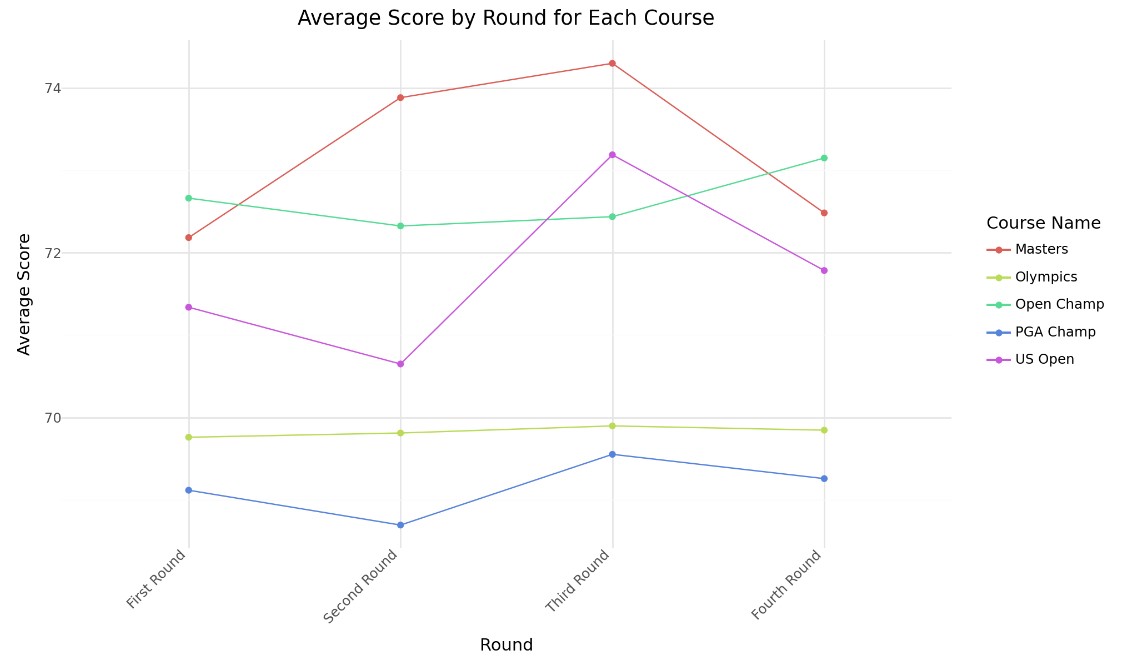 This graph shows the daily average scores across tournaments. Interestingly, tournaments with the lowest overall scores also show minimal variation between rounds. This could relate to factors like weather, course conditions, or player stress. Exploring these trends could help players prepare mentally for tournaments with lots round-to-round variability, like the Masters.
Player Performance across Tournaments
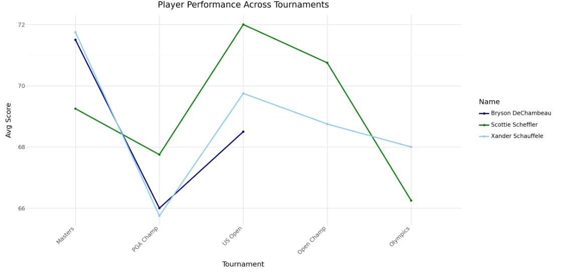 In this graph, I plotted the average round scores throughout the season for players who won a tournament. Once again, the Olympics and PGA Championship appear easier. The data also suggests that no single player dominated throughout the season, and there’s little indication of improvement over time for individual players.
Conclusion
These three graphs are just a starting point for the kinds of insights you can uncover with API data. After completing an EDA, you’ll be able to decide which areas deserve a statistical analysis. With my data, I’m curious about what causes average scores to vary across courses and which factors correlate with these differences. I’m also interested in analyzing individual player performance to identify elements that may contribute to their success. Since this API focuses primarily on scores, I may need to gather additional data from other sources before I move on with these questions.
In conclusion, this guide is a basic introduction to using APIs and Python to analyze data. Even if golf isn’t your favorite, I’d love to hear about the APIs you’re exploring. Feel free to connect with me on LinkedIn or email me to share your projects!