Using machine learning to predict final tournament rankings within the PGA
PGA Predictions
In my last blog post, I used an API to gather data on the 2024 PGA Major Tournaments and conducted a basic exploratory data analysis (EDA). After the last post, I proudly showed my dad but he was less impressed and said something along the lines of, “That’s it? I thought you were a stats major—these are just graphs!” So, for my dad (and anyone else wanting more), this post dives deeper into a PGA statistical analysis, featuring machine learning models and an interactive Streamlit app.
Questions of Interest
Reflecting on the EDA from my previous post, one graph stood out: Daily Averages across Tournaments. There was lots of variation between each day/round and it led me to wonder how much a player’s position in rankings changed throughout a tournament. I decided I would dive deeper into these by answering the following questions:
- Is there a correlation between a player’s position in earlier rounds and their final position?
- Can we predict a player’s final position based on their performance in the first three rounds?
#1 Correlation
follow along with my code
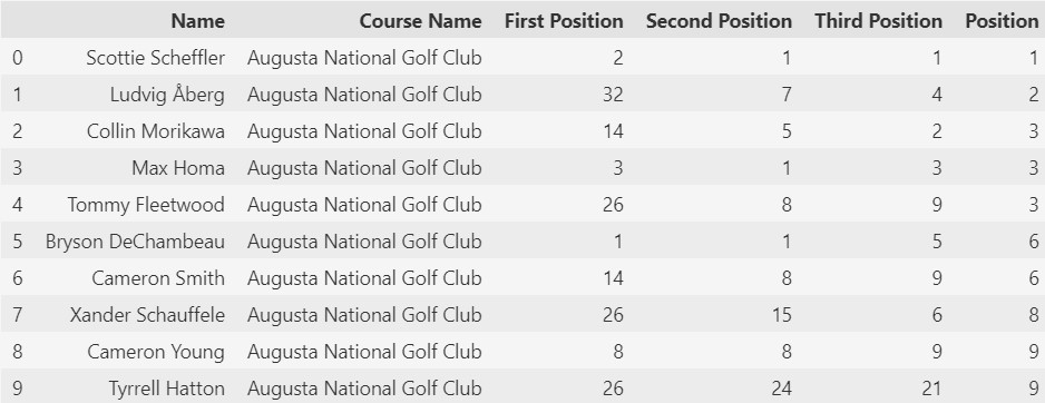
If you remember from my previous post, there weren’t any variables for position after each round. So I created new features by calculating cumulative scores after each round and ranking players accordingly. Then I cleaned up the data to get a dataframe with the positions after each round and the final position.
Next, I plotted a correlation matrix to visualize relationships between these positions. Darker colors and values closer to 1 indicate stronger correlations.
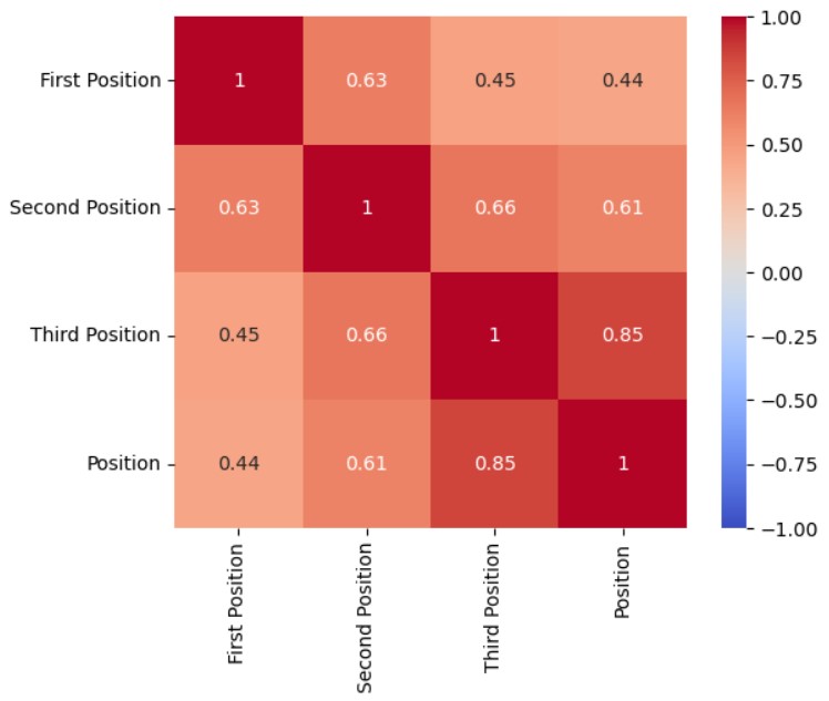
The matrix shows that a player’s final position becomes increasingly determined as a tournament progresses. Unsurprisingly, positions in later rounds have stronger correlations with the final position. This suggests players with consistent performance early on tend to maintain their rankings. Knowing these correlations exist, the next logical step was to see if we could predict a player’s final position before the last round.
#2 Predicting Final Rankings
To answer this, I built four machine-learning models using two datasets:
- Basic Dataframe: Positions by round and the final position.
- Enhanced Dataframe: Includes interaction terms, player and course dummy variables, and difference in ranking between rounds.
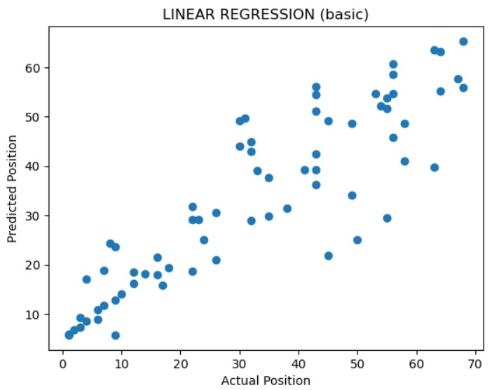
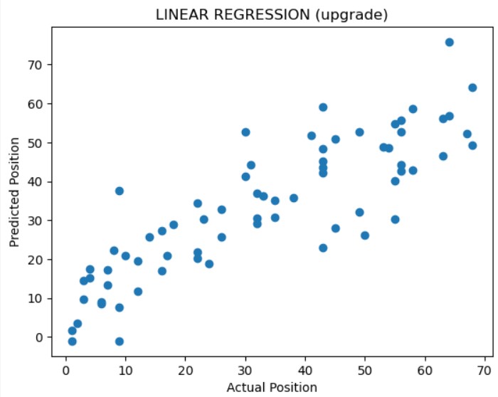
Penalized Linear Regression
Given the linear trends in the data, I started with penalized linear regression. I evaluated model performance using R², a metric indicating how well the model explains variability in the data. An R² value closer to 1 indicates that the model better captures the relationship between the predictors and the target variable, suggesting good predictive performance on the data.
- Basic Model R²: 0.78
- Enhanced Model R²: 0.73
The basic model performed better, likely because the added complexity introduced noise without sufficient new information. Below are the prediction vs. actual plots:
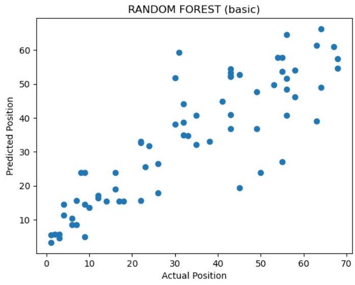
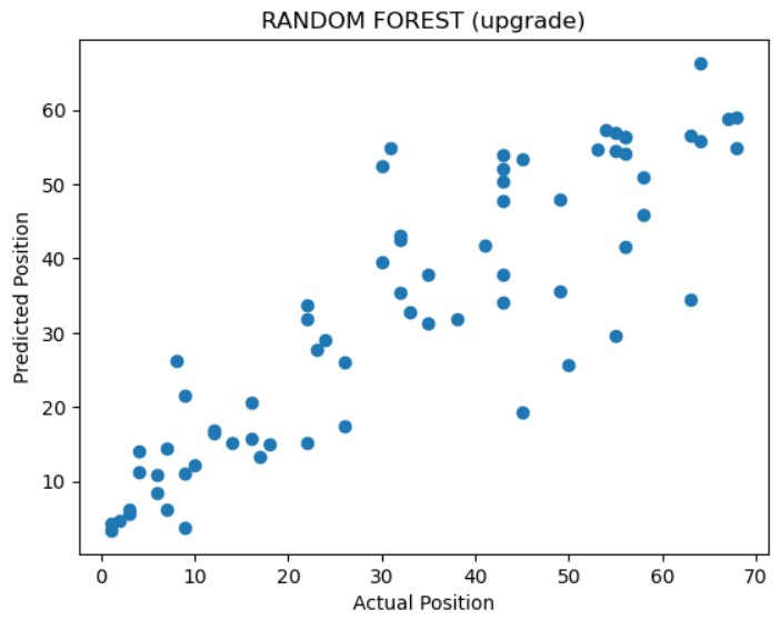
Random Forest
Random forest, while often better suited for non-linear data, provides another perspective. Using the same datasets, I evaluated these models using R²:
- Basic Model R²: 0.75
- Enhanced Model R²: 0.76
Both models performed similarly, but the enhanced model slightly edged out the basic one. I also found that the most influential feature in predicting was the third round position, which aligns with our earlier correlation findings. Below are the prediction vs. actual plots:
Machine Learning Conclusion
Among the four models, penalized linear regression on the basic dataset performed the best with an R² of 0.78. This is probably due to the fact that even with the feature engineering I didn’t have many unique features. If I were to do this again I would find and add more features such as weather, number of bogeys, average swing speed, etc. I would also collect data from more years and more tournaments. These enhancements could improve prediction metrics and help players identify strategies to boost their rankings.
Streamlit App
One of the reasons I love statistics is the ability to take something ordinary and even boring (like golf scores) and extract insights that let you tell a meaningful narrative. I hope this post showed you just a little bit of that process of finding insights beyond the basic data frame. To share this excitement, I built a Streamlit app that lets you explore this PGA data interactively.
Features of the App:
- 2024 Majors: Visualize the top, average, and worst scores across tournaments.
- Player Stats: Analyze and compare player performance throughout the year.
- Golf Resources: Resources to help you go beyond and collect your own golf data
This app is a great starting point for your own analyses. Whether you’re finding correlations, creating models, or something completely different,I’d love for you to try it and share what insights you uncover! You can find the app here. As always, connect with me on LinkedIn to share your thoughts or questions!